Tech News
Mastering Disclosure Patterns: UX Best Practices for Accordion Design
Key Takeaways
- Use clear and descriptive labels for accordion headers.
- Ensure the entire header is clickable to improve usability.
- Implement proper accessibility features to support all users.
- Use subtle animations to enhance the user experience without distracting.
Accordions have become a central part of modern web interfaces, offering an efficient way to arrange large volumes of content in a compact, user-friendly layout. By using accordions, designers can help visitors find information more quickly without feeling overwhelmed by crowding. For those interested in examples and trends, you can browse more accordion web design inspirations online. Well-designed accordions transform dense information into easily digestible sections, offering a smoother navigation experience for all users.
When thoughtfully implemented, accordion components reduce page clutter, enhance accessibility, and improve mobile compatibility. These flexible UI elements minimize distractions and support intuitive interfaces. Their effectiveness depends on best practices, especially labeling, usability, and accessibility, which prevent confusion and poor user experience. Proper content grouping, animations, and responsiveness distinguish a basic accordion from a superior one. Following these principles ensures high usability and inclusivity, with insights from Shopify experts offering additional guidance.
Use Clear and Descriptive Labels
The clarity of accordion headers significantly influences user navigation. Titles should tell users exactly what content will appear when expanded. Labels such as “Shipping Details,” “Return Policy,” or “Technical Specifications” are immediately helpful, whereas generic options like “More Info” offer little guidance. Taking the time to craft specific titles will decrease user hesitation and streamline the browsing process.
Make the Entire Header Clickable
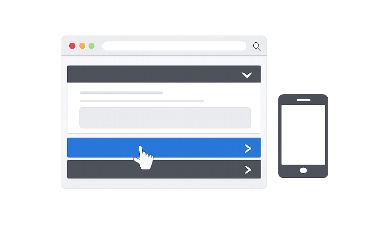
Maximizing the clickable area by making the entire header interactive is an essential part of effective accordion design. When users can click anywhere on the header, rather than just a small icon, they are less likely to make mistakes, especially when accessing a site via mobile or tablet. This practice simplifies navigation, improves conversion rates, and creates a more intuitive environment for all visitors.
Implement Proper Accessibility Features
Accessibility should never be an afterthought in UI development. Accordions must be fully operable with keyboards and readable by screen readers, making use of ARIA attributes such as aria-expanded and aria-controls. These details communicate state changes and relationships within the accordion to assistive technologies, ensuring a seamless experience for everyone, including users with visual or motor challenges.
Use Subtle Animations
Subtle animations can significantly enhance the user experience by providing visual feedback when accordion panels open or close. Animations should be brief and non-distracting, avoiding confusion or frustrating users with slow page performance. The focus should be on smooth transitions that reinforce interface changes without drawing unnecessary attention or impacting accessibility.
Organize Content Logically
Logical organization within each accordion panel is key to keeping users focused and engaged. Grouping related items together enables users to find what they are looking for quickly. For example, grouping FAQ answers by topic or section allows users to scan and select information that matters most to them, creating a more efficient browsing experience.
Limit the Number of Accordion Items
Overusing accordions can create new usability problems by overwhelming users with too many options. Limiting the number of items within the accordion maintains clarity. If you have more information than can fit comfortably, breaking it up using tabs, filters, or even separate pages may provide a better experience. Striking the right balance allows visitors to stay organized and focused, rather than lost in excessive collapsible menus.
Provide Visual Indicators
Visual cues, such as arrows, chevrons, or plus and minus symbols, help users quickly determine if a section is expanded or collapsed. Consistent use of these icons throughout your UI reduces confusion and speeds up navigation. It is important to ensure that visual indicators are clear and distinct enough to be easily recognized on any device or under any lighting condition.
Test Across Devices and Screen Sizes
Responsive design is essential for effective interaction across devices, requiring accordions to function consistently on desktops, tablets, and smartphones. To achieve this, thorough testing across various screen sizes is vital, ensuring that their states, both open and closed, along with animations and interactive elements, function reliably regardless of device. Beyond merely saving space, well-implemented accordions significantly enhance user engagement, usability, and accessibility. Adopting established best practices is fundamental for developing interface components that prioritize functionality, elegance, and inclusivity for all users.
Conclusion
In conclusion, well-designed accordion interfaces enhance usability and content organization by using clear labels, expanding clickable areas, and ensuring accessibility. Details like animations, logical grouping, and visual indicators improve the experience, guiding users smoothly through information. Their effectiveness depends on balancing structure to simplify navigation without overwhelming users. Limiting items, maintaining clarity, and testing across devices ensure seamless interaction. When applied consistently, accordions become powerful tools that foster engagement, clarity, and user-centered design.


How Nevada Rules Shape a Personal Injury Claim After a Crash

A Yard-Watering Plan: Match Soil, Plants, and Sprinklers Before You Turn On the Timer

A Practical Coastal Home Buying Checklist in Panama City, Florida

Piso Wifi 10.0.0.1 Pause Time – Complete Guide

High-Risk Threats Targeting Banks and How to Mitigate Them
